One of the common problems we face when coding with float based layouts is that the wrapper container doesn’t expand to the height of the child floating elements. The typical solution to fix this is by adding an element with clear float after the floating elements or adding a clearfix to the wrapper. But did you know you can also use the overflow property to fix this problem? It’s not a new CSS trick either. It’s been documented before long long ago. Today I would like to revisit the topic along with a few tips.
Demo 1:
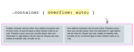
The demo below shows the issue with floating child elements where the parent container doesn’t expand. To fix this problem, you can simply add the CSS property overflow:auto (or overflow:hidden) to the wrapper container. This is perhaps the simplest way to clear floats. .container {
overflow: auto;
}Demo 2:
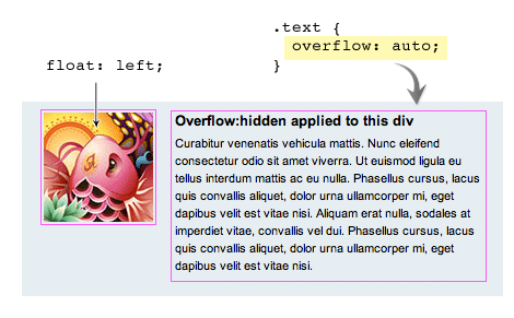
Overflow:auto can also be used to prevent content from wrapping around the floated element. Let’s say you are designing a comment list. You would, most likely, have an avatar floating on the left and the comment to the right. To prevent the comment from wrapping around the avatar just add overflow:hidden to the comment container. The advantage of using overflow here is that I don’t have to set a float or width to the comment container. The container automatically aligns after the floated avatar image. .image {
float: left;
}
.text {
overflow: hidden;
}Drawbacks (see demo)
Although it is a nice trick to clear floats there are some drawbacks:- Using overflow:auto will cause a scrollbar if your content is extending the boundary of the container. For example, if you have a long unbreaking text (ie. long url text) or a large image that is bigger then the container a scrollbar will show.
- To avoid a scrollbar from showing you should use overflow:hidden. Again, there is a drawback to this method as well. Using overflow:hidden will hide any content that exceeds the boundry of the container.
Word-wrap
To solve the long unbreaking text issue, simply add word-wrap:break-word to the container and it will force the text to wrap onto a new line. .container img {
max-width: 100%;
height: auto;
}Max-width
To prevent large images from extending the boundar, add max-width:100% and it will resize the image to the max width of the container. .container {
word-wrap: break-word;
}
Nessun commento:
Posta un commento