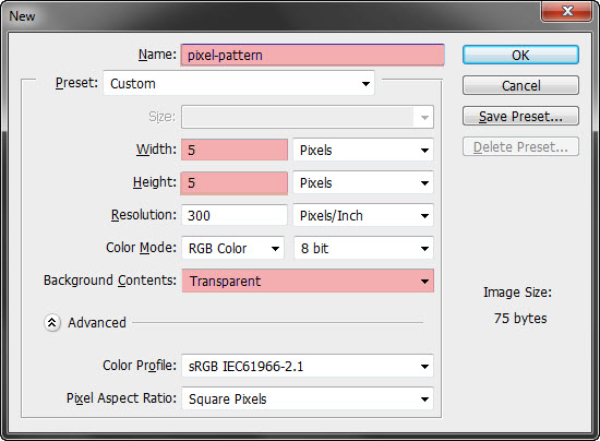
The use of textures and patterns in webdesign has come a long way in
only a short amount of time. From cliche grunge and gaudy vintage
textures, today's best websites use texture in a wide variety of ways to
create a more immersive experience, define the personality of the site
and create a more refined look and feel.
In today's tutorial, we're going to jump straight into some of the ways that you can use texture and patterns to enhance your next design, serve up some inspiring examples of textures used in the right way and also provide a series of mini tutorials to give you an introduction to some of practical ways to include textures in your next project.
Ready to get started?
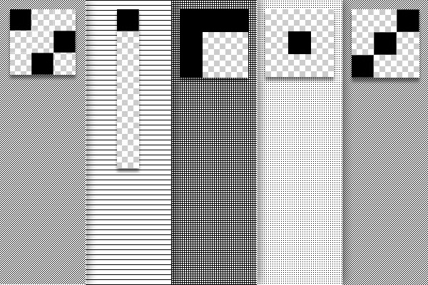
Here's a few examples of some simple tiled patterns along with the corresponding image that was used to create the pattern file zoomed in 3200%.
While patterns most certainly have their place in modern webdesign, it's the creative use of textures that is really capturing the imagination of webdesigers the world over.
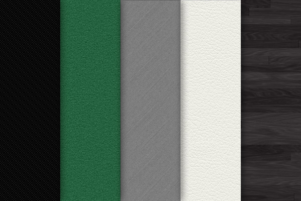
Here's a small sample of examples to give you an idea of the difference between textures and patterns:
The effective use of noise lies in the subtlety of its application. Good noise should be almost indistinguishable to the eye while still breaking up a solid color with small variations of light and dark.
Let's take a look at a traditional utilization of noise in the wild from www.kendoui.com.
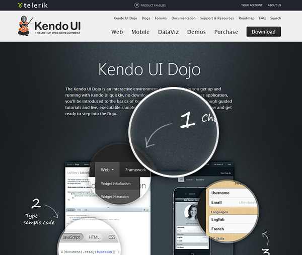 This
example is effective thanks to the use of simulated lighting to create
additional depth and visual interest to the overall design. Also note
that the highlighted areas of the page give the content area a sense of
definition without using a traditional 960px wide solid block color
content area.
This
example is effective thanks to the use of simulated lighting to create
additional depth and visual interest to the overall design. Also note
that the highlighted areas of the page give the content area a sense of
definition without using a traditional 960px wide solid block color
content area.
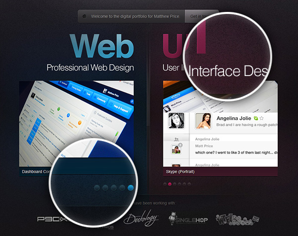
In a similar vein, Matthew Price has used creative lighting effects to highlight his different services and is another great example of how to take a simple noise texture to add a real point of difference to a site:
 Make a selection of the document (Ctrl + A), and add a Color Overlay of #007dba.
Next, generate a noise filter (Filter → Noise → Add Noise) and input the following settings:
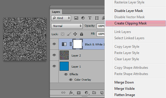
 To
limit the effect of the adjustment layer to only the noise layer (not
the blue layer), create a clipping mask to the adjustment layer by right
clicking the adjustment layer and selecting Create Clipping Mask.
To
limit the effect of the adjustment layer to only the noise layer (not
the blue layer), create a clipping mask to the adjustment layer by right
clicking the adjustment layer and selecting Create Clipping Mask.
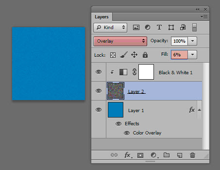
 With
the Noise layer selected, change the blend mode to Overlay and dial the
opacity back to between 5%-8% depending on the base color.
With
the Noise layer selected, change the blend mode to Overlay and dial the
opacity back to between 5%-8% depending on the base color.
This approach can be used to create extremely literal representations, as seen in the following example from Dribbble user Tom Creighton:
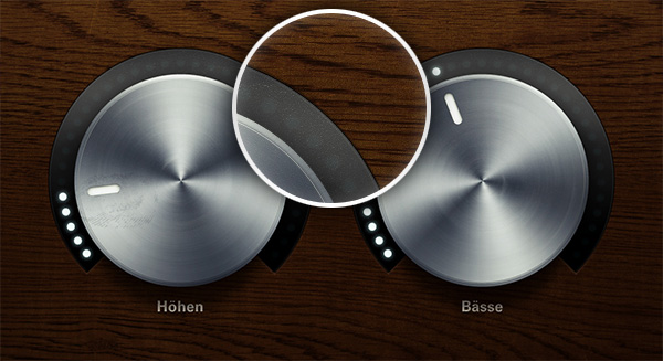 In
particular, note not only the detailed wood texture, but also the
realistic metallic gradient for the dials and the effective use of
shadow.
In
particular, note not only the detailed wood texture, but also the
realistic metallic gradient for the dials and the effective use of
shadow.
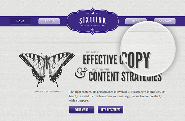
Skeuomorphism doesn't always have to be so literal. In the following example, the copy and content strategists from Six11Ink have used a paper texture to create the illusion that the site is actually rendered on quality stock rather than a screen — a perfect pairing with the company's business focus of written content.
 Layout some guides (Ctrl + R) with the following locations (from the edge of the document).
 Once you’ve extracted the file, open the .png image in Photoshop. Set the image as a pattern (Edit → Define Pattern).
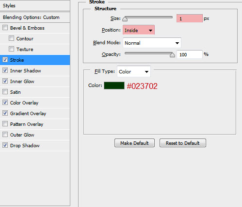
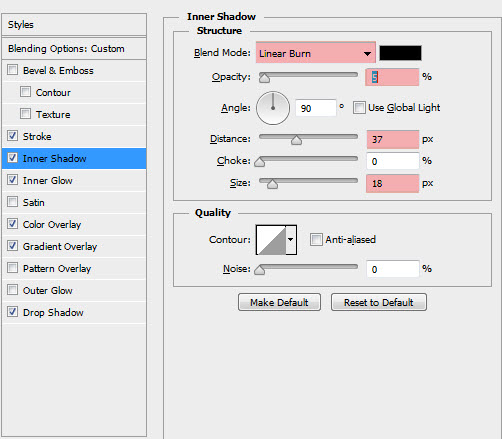
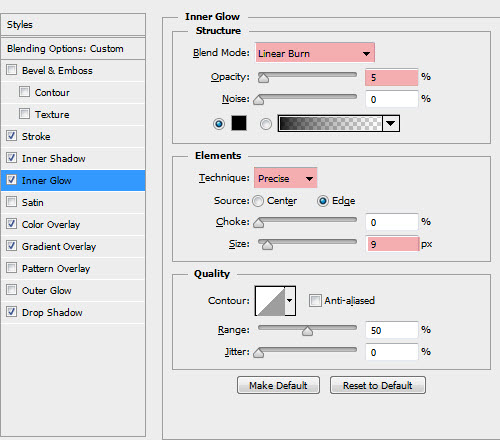
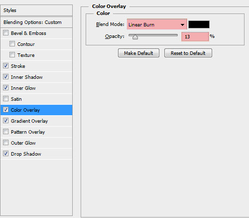
Apply the following layer effects:
 You should be left with the following final result:
The result is often a more sophisticated, polished solution that can tone down and add additional refinement, especially where a solid block of color can either overwhelm or dull down the overall impact of the site.
Take this example from Solid Giant that has used a fairly simple texture to break up a bold color choice:
 Does
this particular design leave you seeing red (or pink)? Textures don't
always need to be so overt. Let's take a look at a more conservative use
of textures in our very own Tuts+ Premium:
Does
this particular design leave you seeing red (or pink)? Textures don't
always need to be so overt. Let's take a look at a more conservative use
of textures in our very own Tuts+ Premium:
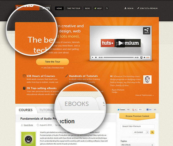 Looking
at the uppermost magnification, we can see the use of three distinct
textures that are used to define the different sections of the page (the
header, the body background and the splash window). While block colors
could have easily been used here, the use of texture adds an additional
layer of attention to detail and intricacy to the design.
Looking
at the uppermost magnification, we can see the use of three distinct
textures that are used to define the different sections of the page (the
header, the body background and the splash window). While block colors
could have easily been used here, the use of texture adds an additional
layer of attention to detail and intricacy to the design.
Also worth noting is the choice of complementary textures used — the textures of the header and the body background share a similar geometric base, use a similar scale share the 45 degree base plane. All of these elements add to the harmony of the overall design.
There are hundreds of examples of effective uses of simple textures to enhance a site's overall aesthetic. Let's take a look at one final example from Visual Republic.
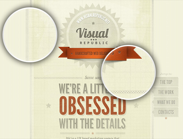 While
it's always best to exercise restraint when employing any design
pattern, this example strikes the perfect balance between coherent
design amd visual interest while remaining reserved and tasteful.
While
it's always best to exercise restraint when employing any design
pattern, this example strikes the perfect balance between coherent
design amd visual interest while remaining reserved and tasteful.
We're going to be taking some inspiration from the Solid Giant example and we'll be using the excellent texture library from Subtle Patterns.
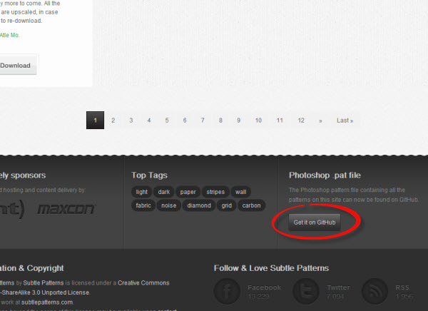
Scroll down to the bottom of the Subtle Patterns site and click the 'Get it on Gihub'. Download the repository and unzip the files to your hardrive.
 Next, open up photoshop and enter the preset manager (Edit → Presets → Preset Manager)
Select 'Patterns' from the drop down select box and click 'Load'. Select the SubtlePatterns.pat file from the downloaded and extracted library (../subtlepatterns-SubtlePatterns-xXXXXX/SubtlePatterns.pat/SubtlePatterns.pat).
 Great!
You've now added the entire Subtle Patterns texture libary to your
Photoshop patterns Which in my opinion will serve you far better for
your projects than the Photoshop default pattern library!).
Great!
You've now added the entire Subtle Patterns texture libary to your
Photoshop patterns Which in my opinion will serve you far better for
your projects than the Photoshop default pattern library!).
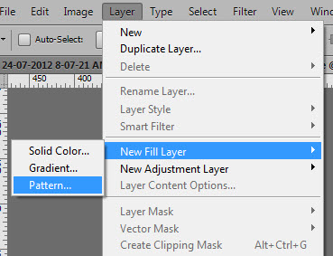
 Next, add a pattern layer to the document (Layer → New Fill layer → Pattern…)
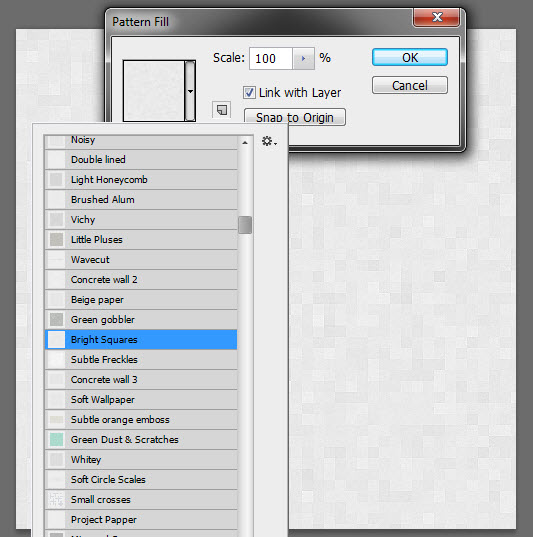
 From the newly downloaded pattern libary, select 'Bright Squares'
We'll be turning this very light texture bright blue in a few steps' time, but to start with, we'll need to tweak the curves, contrast and saturation of the texture.
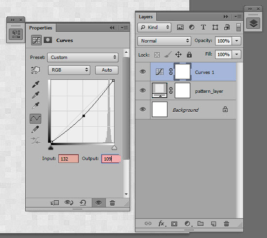
First, add a new Curves layer (Layer → New Adjustment Layer → Curves) and modify the input to 132 and the output to 109.
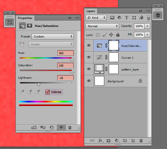
 Next, add a new Hue/Saturation layer (Layer → New Adjustment Layer → Hue/Saturation) and change the hue to 360, the Saturation to 100, the lightness to -28 and check the 'Colorize' box.
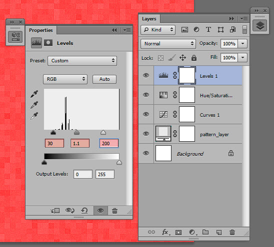
 Next, add a Levels adjustment layer (Layer → New Adjustment Layer → Levels) and change the black threshold to 30, the gray threshold to 1.1 and the white threshold to 200.
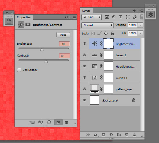
 Finally, add a Brightness/Contrast adjustment layer (Layer → New Adjustment Layer → Brightness/Contrast) and change the brightness to -10 and the set the contrast to 10.
 Note,
depending on your color choice for the final color overlay, the
adjustment layers will all need to be individually tweaked and trial and
error may be required.. Because of this reason, sometimes it is easier
to add the color overlay first and backfill the adjustment layers so
that you can preview the final result while you play with the settings
of the adjustment layers.
Note,
depending on your color choice for the final color overlay, the
adjustment layers will all need to be individually tweaked and trial and
error may be required.. Because of this reason, sometimes it is easier
to add the color overlay first and backfill the adjustment layers so
that you can preview the final result while you play with the settings
of the adjustment layers.
Using a bold display typeface (I'm using Bebas Neue), write out the word 'Texture' in the center of the document:
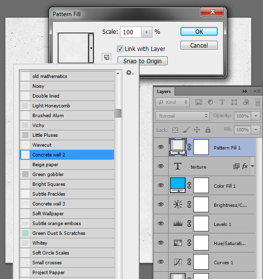
 Next, above the text layer add in a new pattern layer (Layer → New Fill Layer → Pattern) and select 'Concrete Wall 2' from the pattern library.
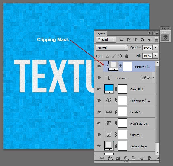
 To constrain the pattern to the text, we'll be using a clipping mask. With the pattern layer selected, create a clipping mask (Layer → Create Clipping Mask).
Take for example the website from i-Avion, a French flight comparison website.
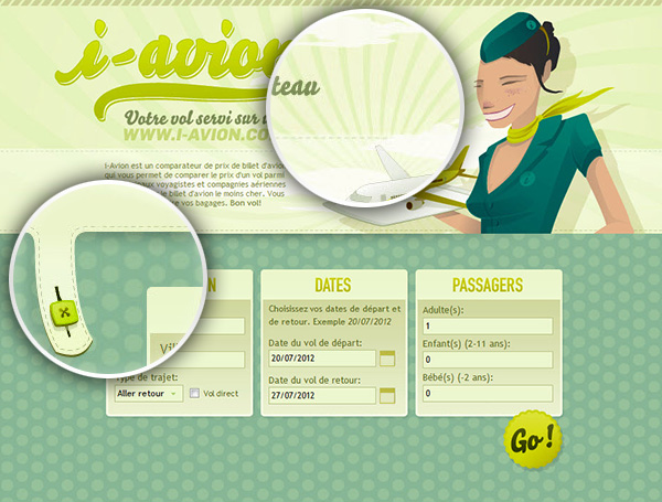 The
main illustration and headline font give the site a distinct retro look
and feel, while still feeling fresh and modern. What really brings the
1970's feel alive, hovever, is the use of a simple blue and white
polka-dot background and a stylized starburst that are both consistent
with design patterns used frequently in mid-century print media.
The
main illustration and headline font give the site a distinct retro look
and feel, while still feeling fresh and modern. What really brings the
1970's feel alive, hovever, is the use of a simple blue and white
polka-dot background and a stylized starburst that are both consistent
with design patterns used frequently in mid-century print media.
If you were to extract just the illustration and the header and remove the textures, this retro look and feel would be diluted at best and, at worst, not conveyed at all, since neither the font choice nor the illustration are sufficiently stylized to carry the entire design.
Another effective example of textures being used to communicate a design aesthetic from another time can be found on the site of Onst Creative.
Again, illustrations have been heavily used to do the grunt work of conveying the look and feel of the site, but as always, the devil is in the details:
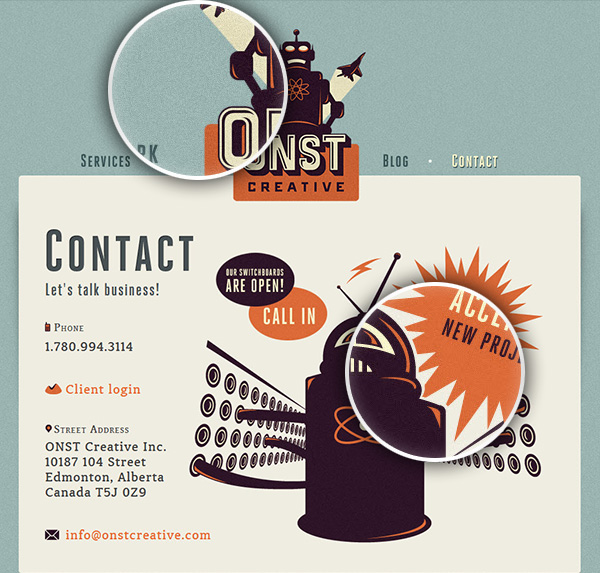 The
site uses heavily a grainy noise texture over most of the elements in
the site of the site from the background to the illustrations to the
headers. This widespread use of a raw texture accompanied with consitent
font choices and mid-century design patterns lends to a user experience
where the site visitor feels more like they're leafing through a
dime-store comic book from the 1950's as opposed to viewing the site on
their new Retina display.
The
site uses heavily a grainy noise texture over most of the elements in
the site of the site from the background to the illustrations to the
headers. This widespread use of a raw texture accompanied with consitent
font choices and mid-century design patterns lends to a user experience
where the site visitor feels more like they're leafing through a
dime-store comic book from the 1950's as opposed to viewing the site on
their new Retina display.
As we talked about earlier, it doesn't get much simpler than pixel patterns. Often only taking up nine or 16 pixels (or even smaller), pixel patterns can be used for dramatic effect.
For our first example of pixel patterns in action, let's take a look at the site from Outside The Wire, a U.S. theater company.
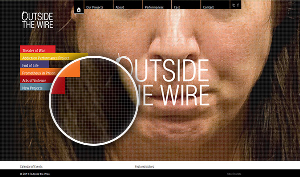 The
site features an arresting full width and height photograph, a design
pattern that is becoming more popular as users' bandwidth and screen
sizes increase across the world. While this is a dramatic design
concept, it's important to remember that it's the site's content that is
the important thing… and with such a high-resolution image, it could be
easy to lose important elements like the navigation and main logo in
the colors, tone and contrast of the image.
The
site features an arresting full width and height photograph, a design
pattern that is becoming more popular as users' bandwidth and screen
sizes increase across the world. While this is a dramatic design
concept, it's important to remember that it's the site's content that is
the important thing… and with such a high-resolution image, it could be
easy to lose important elements like the navigation and main logo in
the colors, tone and contrast of the image.
To remedy this problem, the designers of this site have overlayed a very small repeating grid (12px by 12px and a whopping 1KB to be exact) that reduces the impact of the image and increases the contrast between the background and the design elements of the site.
Another popular application of pixel patterns in website design is to add additional contrast to header tags, especially titles for blog posts and other similar content.
Remember the TutsPlus example that we saw before? Let's take another look at the way their H2 tags are styled:
 As
you can see, the use of a pixel pattern gives a more refined,
interesting look than just the use of a solid block color. And because
this particular pattern repeats itself, it is able to scale to multiple
lines and even different lengths, if required.
As
you can see, the use of a pixel pattern gives a more refined,
interesting look than just the use of a solid block color. And because
this particular pattern repeats itself, it is able to scale to multiple
lines and even different lengths, if required.
Let's create a similar effect in our next mini-tutorial:
I'm going to keep this example pretty basic and just show you the main techniques… There's a lot of scope for further styling here, so feel free to experiment.
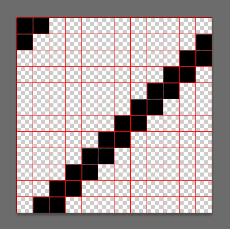
 With a 1px by 1px black square pencil (B), draw out the following pattern (I've used a 1px grid to help me here).
 Next, export the image as a PNG-24 image (Ctrl + Shift + Alt + S) and save it to your desktop.
Head over to the Resources section at Web Semantics and load up the image into the URI converter:
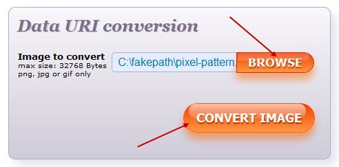 In the following screen, take the background-image code from the 'As Raw Data' window and copy it to your clipboard:
In your CSS, add in the following code, using the raw data from the converter from the previous step:
Firstly, separating the h2 content from the background inside the pseudo :before element allows us to set some padding for the text and play with the opacity of the background image. On different background colors, we may choose to increase or decrease the opacity as required, which allows us to use a single data URI across an entire site, rather than generating multiple .png files and converting each to its own base64 encoded image.
Secondly, the ability to position the background behind the h2 text is made possible by setting the
 Don't want to use Photoshop? You can also recreate this mini-project using Patternify — an online pattern generator that even looks after the Data URI conversion!
For example, take the recent redesign of the National LGBT Museum. This design uses multiple patterns and textures with great effect, and in fact the site could have been used to highlight the use of textures and patterns in some of the other sections of this article. What I want to highlight here is the bold use of a simple patten in the contact section of the site:
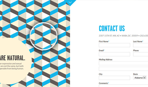 Note
how the design balances a bold repeating pattern with lots of white
space to balance the site and to provide a user experience that is
arresting but not overwhelming.
Note
how the design balances a bold repeating pattern with lots of white
space to balance the site and to provide a user experience that is
arresting but not overwhelming.
In another example, let's take a look at Pop The Box, another site that effectivly combines bold and subtle textures to make a dramatic statement:
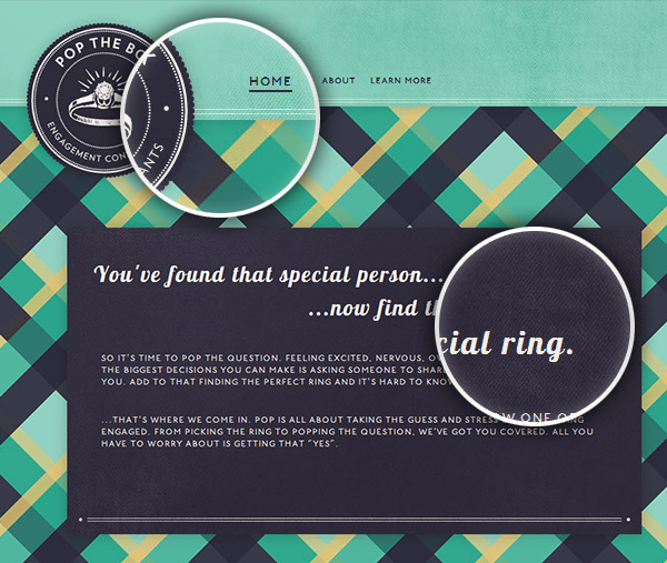 Subtle
fabric textures balance out a bold tartan site background that
complement the site content and provide a clear direction to the site
user to the purpose of the site.
Subtle
fabric textures balance out a bold tartan site background that
complement the site content and provide a clear direction to the site
user to the purpose of the site.
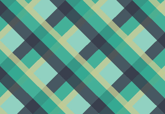
In this mini tutorial, we're going to be approximately recreating the tartan texture in the previous example… but we're only going to be using CSS gradients with no images at all.
As a caveat before we get started, there are advantages and disadvantages of this approach. While we're reducing the need for additional site resources and reducing HTTP requests, both of which can affect site performance, this approach doesn't reach the level of pixel perfection achievable with an image editor. The result can be rendered differently in different browsers and will require a fall back for IE8 and below. So use with caution!
Let's create the bottom most gradient first:
Note, for simplicity's sake, I'm only including -webkit prefixes in this example. You'll need to include appropriate vendor prefixes for additional browsers.
Thanks to the cascading nature of CSS, the second gradient will naturally be rendered on top of the first gradient without the need for changing the z-index of the properties. Also, because we've chosen rgba to define the colors of the gradient, we don't need to pay any consideration to the opacity of the element.
 Or, you can view the code and edit it live on JS Fiddle
As a final note, if you want to create an even cleaner result, or push the bounds of the possibilities of image-free pattern design, you can achieve excellent results using the canvas element and the Patternizer.js script. It's a more complex way of achieving the result shown above, but it may be a better solution depending on your needs.
Of course, we've only just scratched the surface of the use of textures and patterns in webdesign. Every day, innovative designers are pushing the boundaries of the use of textures in their projects with stunning results.
How have you used textures and patterns in your designs? What are your favorite techniques? Leave a comment — we'd love to hear your thoughts!
In today's tutorial, we're going to jump straight into some of the ways that you can use texture and patterns to enhance your next design, serve up some inspiring examples of textures used in the right way and also provide a series of mini tutorials to give you an introduction to some of practical ways to include textures in your next project.
Ready to get started?
Terminology: Textures Vs. Patterns Vs. Background Images
Before we get started, let's take a moment to quickly define the difference between textures, patterns and background images. While the terms are often used interchangably, there are subtle differences between the three that will help you think about the best solution for your designs.Patterns
Generally speaking, patterns are small, simple, image-based and are repeatable on both the x and y axes. In fact, 'patterns' can be generated in only a few pixels — and as such are usually extremely light weight in terms of file size.Here's a few examples of some simple tiled patterns along with the corresponding image that was used to create the pattern file zoomed in 3200%.
Textures
Textures by comparison are usually more complex, have a stronger sense of randomness but, similar to patterns are often designed to be repeated (but this is not always the case).While patterns most certainly have their place in modern webdesign, it's the creative use of textures that is really capturing the imagination of webdesigers the world over.
Here's a small sample of examples to give you an idea of the difference between textures and patterns:
Background Images
Background images are a completely different beast. At least for the purpose of this tutorial think of background images as non-repeating, large and detailed images, illustrations and photographs. While this is an over the top generalization, it serves to illustrate the difference between textures, patterns and background images.Let's Make Some Noise
Noise is one of the most popular use of texture in webdesign today and can be used to add depth and interest to almost any element in almost any design from backgrounds to buttons.The effective use of noise lies in the subtlety of its application. Good noise should be almost indistinguishable to the eye while still breaking up a solid color with small variations of light and dark.
Let's take a look at a traditional utilization of noise in the wild from www.kendoui.com.
In a similar vein, Matthew Price has used creative lighting effects to highlight his different services and is another great example of how to take a simple noise texture to add a real point of difference to a site:
Mini Tutorial: Creating Noise in Photohop
Now that we've seen a couple of examples, let's take a look at how to create a simple noise effect in Photoshop:Step 1: Starting Off
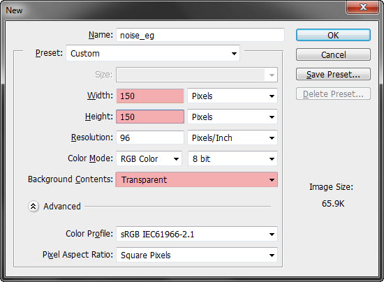
Create a new document 150px x 150px with a transparent background.Step 2: Bring the Noise
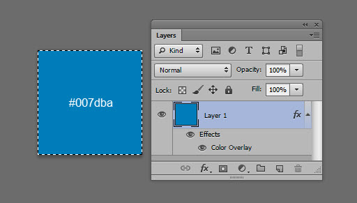
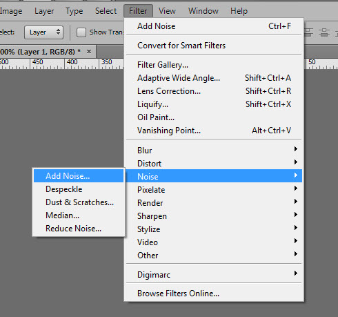
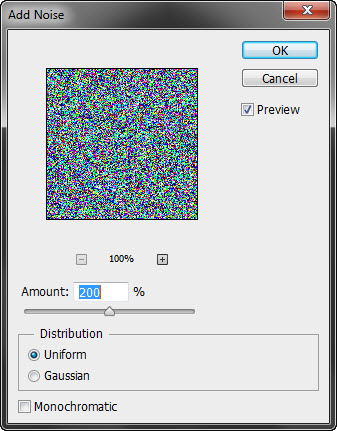
Create a new layer (Ctrl + Shift + N) and fill it with #000000.Next, generate a noise filter (Filter → Noise → Add Noise) and input the following settings:
Step 3: Blending the Noise
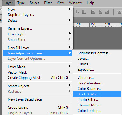
Next, turn the noise texture monochomatic by adding a black and white adustment layer (Layer → Adjustment Layer → Black and White) (note, this is the preferred option to turning the noise gray-scale; the ‘monochromatic’ setting in the noise generator strips away half tones):Step 4: Finishing Touches
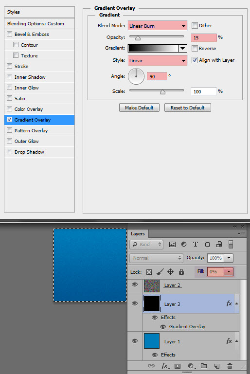
For an optional finishing touch, add another layer above the base color, take the fill to 0% and add a black-to-white linear gradient with a blending mode set to linear burn and an opacity of 15%:Textures for True to Life Effects
Textures can also be used more explicitly to create true-to-life effects to create the illusion of the look of real world effects. Also known as Skeuomorphism, this effect has proved itself to be a enduring trend in interface design.This approach can be used to create extremely literal representations, as seen in the following example from Dribbble user Tom Creighton:
Skeuomorphism doesn't always have to be so literal. In the following example, the copy and content strategists from Six11Ink have used a paper texture to create the illusion that the site is actually rendered on quality stock rather than a screen — a perfect pairing with the company's business focus of written content.
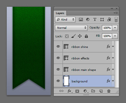
Mini Tutorial: Create a Realistic Fabric Ribbon in Photoshop
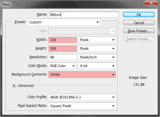
Love 'em or hate 'em, the chances are pretty good that you'll be creating a life-like ribbon in a future project. In this mini-project, we’ll be creating a realistic fabric ribbon in Photoshop with the help of a pattern library.Step 1: Create a New Document
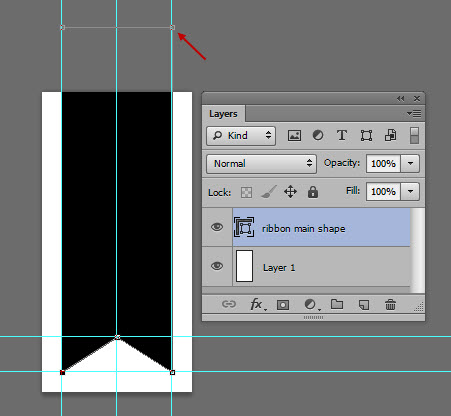
Create a new document (Ctrl + N) 150px x 300px and fill it with white:Step 2: Draw Out a Ribbon Shape
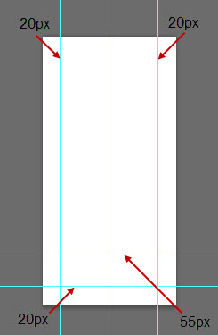
On a new layer, and with the pen tool set to 'Shape', draw out the following shape using the intersections of the guides to help you. Note that the top edge of the ribbon exceeds the top of the document.Step 3: Download the Texture
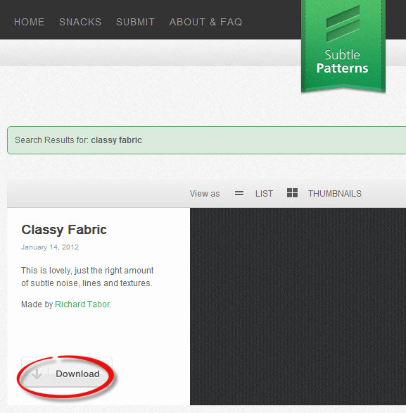
Download the Classy Fabric texture from Subtle Patterns.Step 4: Add the Texture to the Ribbon
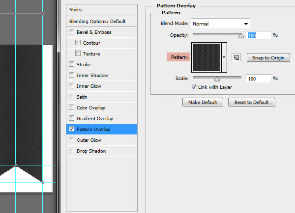
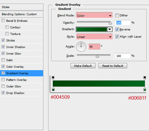
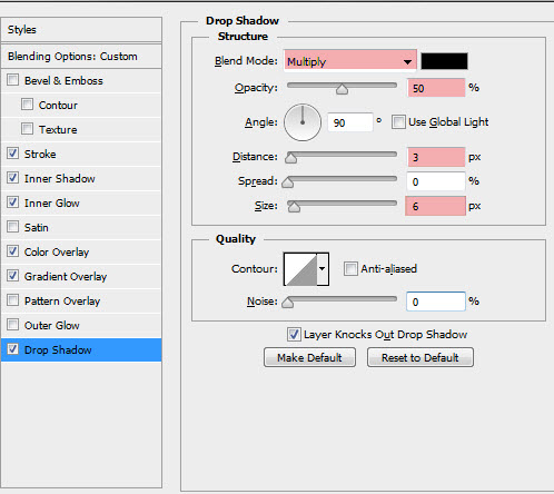
Return to your Ribbon.psd document and apply the Class Fabric texture as a layer effect to the ribbon shape:Step 5: Layer Effects
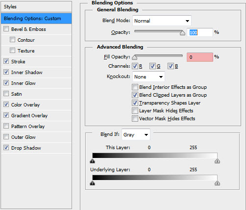
Duplicate the main ribbon shape to a new layer (Layer → Duplicate Layer) and name it 'Ribbon Effects'.Apply the following layer effects:
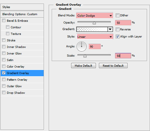
Step 6: Add a Subtle Glow
Duplicate the main ribbon shape again and place it at the top of your layer stack. Apply a 0% white opacity → 100% white opacity gradient with the following settings:Step 7: Finishing Up
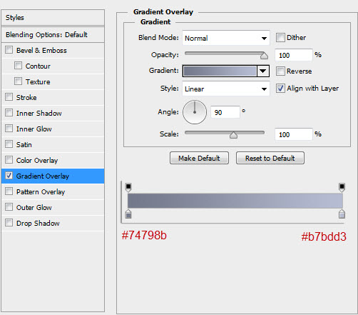
To finish up, return to your bottom most layer (i.e. the document background) and apply the following gradient:Textures to Add Visual Interest
While solid block colors have been a mainstay of effective webdesign for years (and certainly still have a place in modern design), increasingly designers have been employing the creative use of textures to add additional visual interest to the components of their projects.The result is often a more sophisticated, polished solution that can tone down and add additional refinement, especially where a solid block of color can either overwhelm or dull down the overall impact of the site.
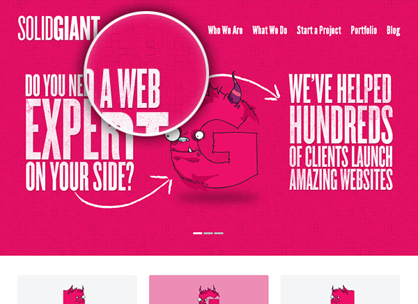
Take this example from Solid Giant that has used a fairly simple texture to break up a bold color choice:
Also worth noting is the choice of complementary textures used — the textures of the header and the body background share a similar geometric base, use a similar scale share the 45 degree base plane. All of these elements add to the harmony of the overall design.
There are hundreds of examples of effective uses of simple textures to enhance a site's overall aesthetic. Let's take a look at one final example from Visual Republic.
Mini Tutorial: Modify and Colorize a Texture
There are lots of resources online where you can download images and .pat files for unrestricted use for your personal and commercial projects. In this mini tutorial, we're going to load up Photoshop with a complete bank of modern, tasteful textures and modfiy a texture to match our design needs.We're going to be taking some inspiration from the Solid Giant example and we'll be using the excellent texture library from Subtle Patterns.
Step 1: Download and Install the Texture Library
Head on over to the Subtle Patterns website. While you can browse for and download your favorite textures individually, you can also download the entire current library from Github.Scroll down to the bottom of the Subtle Patterns site and click the 'Get it on Gihub'. Download the repository and unzip the files to your hardrive.
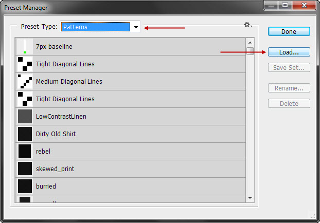
Select 'Patterns' from the drop down select box and click 'Load'. Select the SubtlePatterns.pat file from the downloaded and extracted library (../subtlepatterns-SubtlePatterns-xXXXXX/SubtlePatterns.pat/SubtlePatterns.pat).
Step 2: Create a New Document
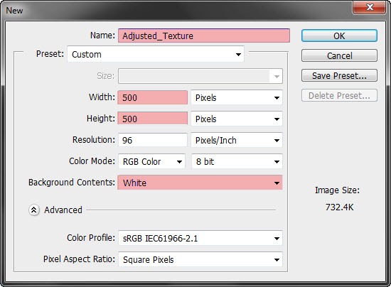
Create a new document (Ctrl + N) 500px x 500px with a white background:Step 3: Adjustment Layers
One of the first things that you'll notice about the Subtle Patterns library is that almost all of the textures are monochromatic and are either dark or light. While this is great for a design that is based on shades of blacks and whites, it makes it more tricky to colorize the texture.We'll be turning this very light texture bright blue in a few steps' time, but to start with, we'll need to tweak the curves, contrast and saturation of the texture.
First, add a new Curves layer (Layer → New Adjustment Layer → Curves) and modify the input to 132 and the output to 109.
Step 4: Colorize the Texture
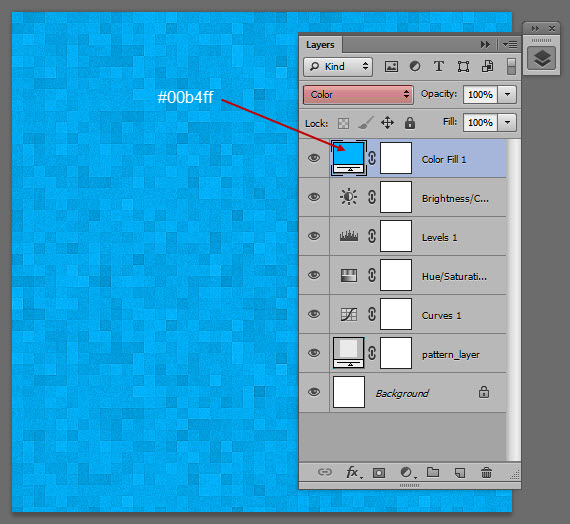
In your layer stack, add a color fill layer (Layer → New Fill Layer → Solid Color…) and set the color to #00b4ff. Set the blending mode to 'Color' and keep the opacity at 100%.Step 5: Add Patterned Text
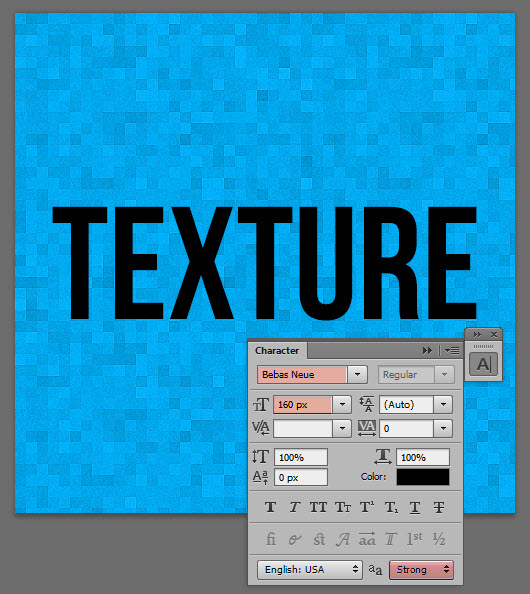
Now that we've created our colorized and adjusted texture, let's complete this mini-project with some patterned text.Using a bold display typeface (I'm using Bebas Neue), write out the word 'Texture' in the center of the document:
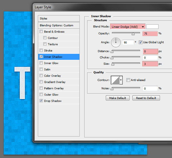
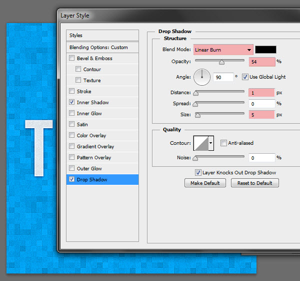
Step 6: Finishing Layer Styles
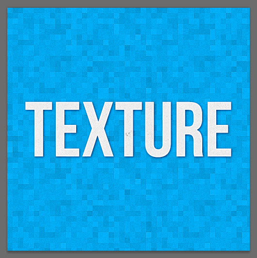
To complete the look of the text, add the following layer styles to the text layer:Final Result
Our final result:Textures to Define a Certain Look, Tone or Feel
We saw how designers are using textures to simply add visual interest in the previous example. Taking this idea one step further, textures can also be used to define a particular look, tone or feel that is consistent with the overall design concept of the site.Take for example the website from i-Avion, a French flight comparison website.
If you were to extract just the illustration and the header and remove the textures, this retro look and feel would be diluted at best and, at worst, not conveyed at all, since neither the font choice nor the illustration are sufficiently stylized to carry the entire design.
Another effective example of textures being used to communicate a design aesthetic from another time can be found on the site of Onst Creative.
Again, illustrations have been heavily used to do the grunt work of conveying the look and feel of the site, but as always, the devil is in the details:
Simple Repeating Pixel Patterns
Up to this point, we've mainly focused on the application of textures in website design. No article on this topic would be complete without a look at the use of repeating pixel patterns in website design.As we talked about earlier, it doesn't get much simpler than pixel patterns. Often only taking up nine or 16 pixels (or even smaller), pixel patterns can be used for dramatic effect.
For our first example of pixel patterns in action, let's take a look at the site from Outside The Wire, a U.S. theater company.
To remedy this problem, the designers of this site have overlayed a very small repeating grid (12px by 12px and a whopping 1KB to be exact) that reduces the impact of the image and increases the contrast between the background and the design elements of the site.
Another popular application of pixel patterns in website design is to add additional contrast to header tags, especially titles for blog posts and other similar content.
Remember the TutsPlus example that we saw before? Let's take another look at the way their H2 tags are styled:
Let's create a similar effect in our next mini-tutorial:
Mini Tutorial: Style a Header With a Pixel Pattern
For this small project, we're going to be adding a little extra finesse to a blog post title through the use of CSS… and no image files.I'm going to keep this example pretty basic and just show you the main techniques… There's a lot of scope for further styling here, so feel free to experiment.
Step 1: Create a Pixel Pattern in Photoshop
Fire up photoshop, create a new document (Ctrl + N), 12px by 12px with a transparent background.Step 2: Convert the Pattern to a Data URI
In this project, we're going to be applying the pattern as a data URI — a representation of the PNG file in pure data that the browser can render as an image. This is an optional step (you could just use an image), but using this technique reduces an http request and is a perfect application for a small image file like this one.Head over to the Resources section at Web Semantics and load up the image into the URI converter:
Step 3: Markup and Style a Basic Blog Post
Next, fire up your text editor and markup a very simple blog post:In the head of the document, create a style tag and define some basic styles (or create a new css document and link to it in the document head):Using Pixel Patterns for Headers
Suspendisse elementum odio vel ligula pretium eu vehicula libero gravida. Vestibulum porta pellentesque mauris. Curabitur a enim ac nibh sodales blandit. Donec faucibus tempus erat, non blandit enim euismod vitae. Duis adipiscing erat at nisi semper consectetur. Quisque non vestibulum elit. Curabitur ac lorem urna. Nullam rutrum tristique erat a bibendum. Quisque dapibus lacus elementum turpis accumsan accumsan.
body {background-color:gray;
}
article {
  width:600px;
  margin: 0 auto;
  background-color:white;
  padding:25px 20px 20px 20px;
  /* Postioning the article as relative allows us to position its children absolutely inside the container */
  position:relative;
}
h2 {
  font-family: arial;
  font-size:25px;
  display:inline-block;
  padding:0 20px 20px 20px;
  line-height:1.5;
  margin-bottom:35px;
}
Step 4: Style the H2 Background
In this step, we're going to give our H2 tag a background with our newly created Data URI.In your CSS, add in the following code, using the raw data from the converter from the previous step:
h2:before {
  content:'';
  /* The Data URI is added directly into the code */
  background-image: url(data:image/png;base64,iVBORw0KGgoAAAANSUhEUgAAAAwAAAAMCAYAAABWdVznAAAAGXRFWHRTb2Z0d2FyZQBBZG9iZSBJbWFnZVJlYWR5ccllPAAAAyJpVFh0WE1MOmNvbS5hZG9iZS54bXAAAAAAADw/eHBhY2tldCBiZWdpbj0i77u/IiBpZD0iVzVNME1wQ2VoaUh6cmVTek5UY3prYzlkIj8+IDx4OnhtcG1ldGEgeG1sbnM6eD0iYWRvYmU6bnM6bWV0YS8iIHg6eG1wdGs9IkFkb2JlIFhNUCBDb3JlIDUuMy1jMDExIDY2LjE0NTY2MSwgMjAxMi8wMi8wNi0xNDo1NjoyNyAgICAgICAgIj4gPHJkZjpSREYgeG1sbnM6cmRmPSJodHRwOi8vd3d3LnczLm9yZy8xOTk5LzAyLzIyLXJkZi1zeW50YXgtbnMjIj4gPHJkZjpEZXNjcmlwdGlvbiByZGY6YWJvdXQ9IiIgeG1sbnM6eG1wPSJodHRwOi8vbnMuYWRvYmUuY29tL3hhcC8xLjAvIiB4bWxuczp4bXBNTT0iaHR0cDovL25zLmFkb2JlLmNvbS94YXAvMS4wL21tLyIgeG1sbnM6c3RSZWY9Imh0dHA6Ly9ucy5hZG9iZS5jb20veGFwLzEuMC9zVHlwZS9SZXNvdXJjZVJlZiMiIHhtcDpDcmVhdG9yVG9vbD0iQWRvYmUgUGhvdG9zaG9wIENTNiAoV2luZG93cykiIHhtcE1NOkluc3RhbmNlSUQ9InhtcC5paWQ6M0FDRkFCMDVFRjhBMTFFMUEyNThCMjM4M0E1NUNBQzciIHhtcE1NOkRvY3VtZW50SUQ9InhtcC5kaWQ6M0FDRkFCMDZFRjhBMTFFMUEyNThCMjM4M0E1NUNBQzciPiA8eG1wTU06RGVyaXZlZEZyb20gc3RSZWY6aW5zdGFuY2VJRD0ieG1wLmlpZDozQUNGQUIwM0VGOEExMUUxQTI1OEIyMzgzQTU1Q0FDNyIgc3RSZWY6ZG9jdW1lbnRJRD0ieG1wLmRpZDozQUNGQUIwNEVGOEExMUUxQTI1OEIyMzgzQTU1Q0FDNyIvPiA8L3JkZjpEZXNjcmlwdGlvbj4gPC9yZGY6UkRGPiA8L3g6eG1wbWV0YT4gPD94cGFja2V0IGVuZD0iciI/PvYCwlYAAABQSURBVHjalM8xDgAgCAPAlv//GYMGoxEROzFcFQhAMUJVH+8RxyiEpMoP3l7O1nHcx9feK15vKOG0EGHbRn5w+EOGj8ILb4UKnoUqtjQBBgC7kCccYRlZngAAAABJRU5ErkJggg==);
  /* Make sure that the pattern repeats itself on the x and y axes */
  background-repeat:repeat;
  width:100%;
  height:40px;
  /* The element is positioned relatively to the article tag */
  position:absolute;
  /* Reduce the opacity of the pattern */
  opacity:.2;
  margin-left:-20px;
}
While this should be fairly self explanatory, there are a couple of notes to be made.Firstly, separating the h2 content from the background inside the pseudo :before element allows us to set some padding for the text and play with the opacity of the background image. On different background colors, we may choose to increase or decrease the opacity as required, which allows us to use a single data URI across an entire site, rather than generating multiple .png files and converting each to its own base64 encoded image.
Secondly, the ability to position the background behind the h2 text is made possible by setting the
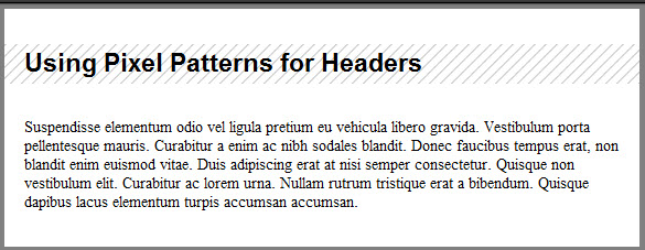
Final Result
Here's a screenshot of the final result, or you can play with the JS Fiddle here.Textures to Make a Big Impact
So far, we've talked mainly about subtle, unobstructive patterns that complement and enhance an existing design, but that do not necessarily make a big design statement in themselves. In this section, let's take a look at a couple of examples where the textures or patterns are used make a big impact in and of themselves.For example, take the recent redesign of the National LGBT Museum. This design uses multiple patterns and textures with great effect, and in fact the site could have been used to highlight the use of textures and patterns in some of the other sections of this article. What I want to highlight here is the bold use of a simple patten in the contact section of the site:
In another example, let's take a look at Pop The Box, another site that effectivly combines bold and subtle textures to make a dramatic statement:
Mini Tutorial: Who Needs Photoshop?
So far, we've looked into creating textures and patterns in Photoshop, exporting the images and using them as repeating background images in CSS.In this mini tutorial, we're going to be approximately recreating the tartan texture in the previous example… but we're only going to be using CSS gradients with no images at all.
As a caveat before we get started, there are advantages and disadvantages of this approach. While we're reducing the need for additional site resources and reducing HTTP requests, both of which can affect site performance, this approach doesn't reach the level of pixel perfection achievable with an image editor. The result can be rendered differently in different browsers and will require a fall back for IE8 and below. So use with caution!
Step 1: Markup
The markup for this mini project is dead easy. All we need to do is to create a div with an arbitrary height of 600px that will contain the repeating gradient background:And now, the base css:
body {
  background-color:#91d1c0;
}
div {
  height:600px;
}
Step 2: Create the First Half of our Gradient
This background is going to have two overlapping gradient overlays made up of multiple stops, one at 45° and the second at -45°.Let's create the bottom most gradient first:
Note, for simplicity's sake, I'm only including -webkit prefixes in this example. You'll need to include appropriate vendor prefixes for additional browsers.
div {
height:600px;
/* The gradient is defined within a background image property */
    background-image:
/* The gradient is instructed to repeat on both x and y axes and at a 45deg angle */
    -webkit-repeating-linear-gradient(45deg,
/* The first 60px of the pattern is transparent, where the body color will display */
    transparent 0%, transparent 60px,
/* From 60px to 100px two stops are defined, each with an identical color (dark purple) */
    rgba(54,57,72,.8) 60px, rgba(54,57,72,.8) 100px,
/* From 100px to 140px two stops are defined, each with the teal color */
    rgba(50,168,142,.8) 100px, rgba(50,168,142,.8) 140px,
/* From 140px to 160px, the thin yellow stripe is defined in two stops */
    rgba(194,201,147,.8) 140px, rgba(194,201,147,.8) 160px)
/* We need to add a comma at the end of the expression to tell the browser to expect a second background image component
    ,
}
Step 3: Create the Second Half of the Gradient
The final step of this technique is to take the gradient that we've already created and replicate it exactly with the exception of changing the angle of the linear gradient to -45°.Thanks to the cascading nature of CSS, the second gradient will naturally be rendered on top of the first gradient without the need for changing the z-index of the properties. Also, because we've chosen rgba to define the colors of the gradient, we don't need to pay any consideration to the opacity of the element.
div {
    ...
    ...
/* Note the change in the linear gradient angle */
-webkit-repeating-linear-gradient(-45deg,
    transparent 0%,transparent 60px,
    rgba(54,57,72,.8) 60px, rgba(54,57,72,.8) 100px,
    rgba(50,168,142,.8) 100px, rgba(50,168,142,.8) 140px,
    rgba(194,201,147,.8) 140px, rgba(194,201,147,.8) 160px)
    /* A Semi-colon finalises the background-image property */
    ;
 }
Final Result
Our final code:body {
background-color:#91d1c0;
}
div {
height:600px;
background-image: -webkit-repeating-linear-gradient(45deg,
transparent 0%, transparent 60px,
rgba(54,57,72,.8) 60px, rgba(54,57,72,.8) 100px,
rgba(50,168,142,.8) 100px, rgba(50,168,142,.8) 140px,
rgba(194,201,147,.8) 140px, rgba(194,201,147,.8) 160px),
-webkit-repeating-linear-gradient(-45deg,
transparent 0%,transparent 60px,
rgba(54,57,72,.8) 60px, rgba(54,57,72,.8) 100px,
rgba(50,168,142,.8) 100px, rgba(50,168,142,.8) 140px,
rgba(194,201,147,.8) 140px, rgba(194,201,147,.8) 160px)
;
}
Here's an image of the final result:As a final note, if you want to create an even cleaner result, or push the bounds of the possibilities of image-free pattern design, you can achieve excellent results using the canvas element and the Patternizer.js script. It's a more complex way of achieving the result shown above, but it may be a better solution depending on your needs.
Conclusion
If you've followed along with the mini-tutorials in this article, you'll be well armed with some of the more progressive applications of textures and patterns in website design — as well as hopefully taking inspiration from a wide range of some of the best examples available.Of course, we've only just scratched the surface of the use of textures and patterns in webdesign. Every day, innovative designers are pushing the boundaries of the use of textures in their projects with stunning results.
How have you used textures and patterns in your designs? What are your favorite techniques? Leave a comment — we'd love to hear your thoughts!
Nessun commento:
Posta un commento